
Hello guys today , we will explain some of the best chart patterns for trading, how they work, how beginners can identify them, and how to use them with proper risk management.
Welcome to JD Trading Zone
Important: This article is for educational purposes only. Trading involves risk, and no chart pattern can guarantee profits.
Chart patterns are one of the most useful tools in technical analysis. They help traders understand how price is behaving and identify potential areas where a trend may continue or reverse.
However, a chart pattern is not a guaranteed buy or sell signal. The same pattern can produce different results depending on market conditions, volume, timeframe, support and resistance, and overall trend.
Also check:- (Best Risk Management Strategy for a Small Trading Account) (How to Avoid Overtrading) (Gap-Up and Gap-Down Trading Guide) (Opening Range Breakout Strategy) (How to build consistency in trading)
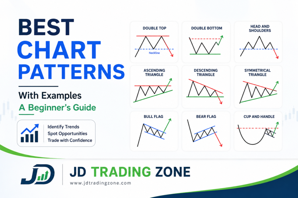
Best Chart Patterns in Trading
What Are Chart Patterns?
A chart pattern is a recognizable formation created by price movement on a trading chart.
When buyers and sellers interact repeatedly around certain price levels, the resulting price movement can sometimes form shapes such as:
• Triangles
• Rectangles
• Head and shoulders
• Double tops
• Double bottoms
• Flags
• Pennants
• Wedges
• Cup and handle
Traders study these formations because they can provide clues about the possible next direction of price.
For example, if a stock repeatedly fails to move above a particular resistance level and eventually breaks below a support level, a trader may interpret that movement as a potential bearish setup.
The key word is potential.
A pattern should be treated as a setup that requires confirmation—not as a prediction of what will definitely happen next.
Why Are Chart Patterns Important?
Chart patterns can help traders structure their decisions instead of entering trades randomly.
They can potentially help with:
1. Identifying possible breakouts
2. Finding potential trend-reversal areas
3. Understanding market consolidation
4. Planning entries
5. Placing logical stop-losses
6. Identifying potential profit targets
7. Understanding the relationship between buyers and sellers
For beginners, chart patterns can also provide a simple framework for reading price action.
However, learning the shape of a pattern is only the beginning.
A good trader also considers trend, volume, support and resistance, timeframe, volatility, and risk-to-reward ratio.
1. Double Top Pattern
The double top is a commonly discussed bearish reversal pattern.
It generally develops after an upward movement and consists of two relatively similar highs separated by a pullback.
Basic structure
Price:
Rises → forms first high → pulls back → rises again → forms second high → breaks support
The area between the two highs creates an important support level called the neckline.
Example
Imagine a stock moves from ₹100 to ₹120.
It then falls to ₹112 before rising again to ₹119.
The price struggles to move above ₹120 and falls below ₹112.
The structure can be interpreted as:
₹100 → ₹120 → ₹112 → ₹119 → break below ₹112
The break below ₹112 provides confirmation that the pattern may be developing into a bearish reversal.
How traders may approach it
A conservative approach is to wait for:
• The second high to form
• Price to break below the neckline
• Ideally, increased trading activity or volume during the breakdown
• Confirmation from the broader market or another technical factor
A stop-loss may be considered above the recent swing high, depending on the trading plan.
→ Common mistake
Do not automatically short a stock simply because it has two similar highs.
The pattern is incomplete until the important support/neckline is broken.
2. Double Bottom Pattern
The double bottom is broadly the opposite of the double top.
It often develops after a decline and may indicate a potential bullish reversal.
Basic structure
Price:
Falls → forms first low → rebounds → falls again → forms second low → breaks resistance
The resistance between the two lows acts as the neckline.
Example
Suppose a stock falls from ₹200 to ₹170.
It rebounds to ₹182 and later falls back toward ₹171.
If buyers defend the ₹170 area and price eventually breaks above ₹182, traders may view this as confirmation of a possible bullish reversal.
Important confirmation
The second low does not automatically mean the market will rise.
The important event is usually the break above the neckline/resistance.
Potential target
Some traders estimate a target by measuring the distance between the bottom and neckline and projecting a similar distance above the breakout.
For example:
• Bottom = ₹170
• Neckline = ₹182
• Pattern height = ₹12
A theoretical measured move could therefore be around:
₹182 + ₹12 = ₹194
This is only a projection, not a guaranteed price target.
3. Head and Shoulders Pattern
The head and shoulders pattern is one of the most recognizable reversal formations.
It typically consists of:
• Left shoulder
• Head
• Right shoulder
• Neckline
The head is usually higher than both shoulders.
Example
Imagine a stock moves:
• First high: ₹150 — left shoulder
• Second high: ₹165 — head
• Third high: ₹152 — right shoulder
If the important neckline is around ₹140 and price breaks below it, traders may consider the pattern confirmed.
Why does it matter?
The pattern represents a change in market structure.
Initially, buyers are strong enough to create higher prices.
Eventually, the market makes a final higher high—the head—but then fails to maintain the upward momentum.
When the right shoulder forms and the neckline breaks, sellers may gain control.
Potential target
A common technical approach is to measure the vertical distance from the head to the neckline and project that distance downward from the neckline.
Again, this is a measured-move estimate, not a guaranteed target.
4. Inverse Head and Shoulders
The inverse head and shoulders is essentially the opposite structure.
It can appear after a downtrend and may indicate a potential bullish reversal.
The formation consists of:
• Left shoulder
• Head
• Right shoulder
• Neckline
The head forms the lowest point.
Example
Suppose a stock falls:
₹150 → ₹130 → ₹145 → ₹120 → ₹143 → ₹130
If price then breaks above the neckline around ₹145, the pattern may receive bullish confirmation.
What should beginners watch?
Look for:
• A previous downtrend
• Three recognizable lows
• The middle low being the deepest
• A clear neckline
• A decisive breakout
• Supporting volume or momentum where appropriate
Avoid forcing every three-low formation into an inverse head-and-shoulders pattern.
5. Ascending Triangle
An ascending triangle is generally considered a bullish continuation or breakout pattern.
It commonly contains:
• Relatively flat resistance
• Rising support
This shows that buyers are gradually accepting higher prices while sellers continue defending a particular resistance level.
Example
Suppose a stock repeatedly reaches ₹500 but cannot break it.
Meanwhile, its pullbacks occur around:
₹470 → ₹480 → ₹490
The rising lows suggest increasing buying pressure.
If price eventually breaks above ₹500 with convincing momentum, traders may interpret it as a bullish breakout.
Important warning
An ascending triangle does not always break upward.
A failed breakout can quickly turn into a bearish move.
That is why traders often wait for confirmation instead of entering simply because the pattern looks bullish.
6. Descending Triangle
The descending triangle is generally associated with bearish continuation or breakdown setups.
It usually consists of:
• Relatively flat support
• Lower highs
Example
Suppose a stock repeatedly finds buyers near ₹400.
However, its highs gradually decline:
₹450 → ₹435 → ₹420
Eventually, price breaks below ₹400.
That breakdown may indicate that sellers have gained control.
Trading consideration
A trader may wait for a confirmed breakdown and then consider whether the setup offers an acceptable risk-to-reward ratio.
A stop-loss can be positioned according to the structure rather than choosing an arbitrary number.
7. Symmetrical Triangle
A symmetrical triangle forms when price creates:
• Lower highs
• Higher lows
The trading range gradually contracts.
Eventually, price may break either upward or downward.
Example
Imagine a stock moves:
₹100 → ₹120 → ₹105 → ₹115 → ₹108 → ₹112
The highs are declining while the lows are rising.
This creates a narrowing structure.
The important point is that a symmetrical triangle does not provide a guaranteed direction.
Traders often wait for the breakout.
→ Bullish breakout
If price breaks above the upper trendline, traders may look for a potential bullish continuation.
→ Bearish breakout
If price breaks below the lower trendline, traders may look for a potential bearish move.
8. Bull Flag Pattern
A bull flag is commonly associated with a strong upward movement followed by a relatively short consolidation or pullback.
The structure often looks like:
Strong rise → consolidation → potential upward breakout
Example
Suppose a stock rises rapidly from ₹100 to ₹125.
Instead of immediately continuing upward, it moves sideways between ₹120 and ₹123.
This consolidation can resemble a small downward-sloping channel or flag.
If price breaks above the flag, traders may look for continuation.
What makes a bull flag more interesting?
Traders may pay attention to:
• Strong initial price movement
• Controlled consolidation
• Reduced activity during consolidation
• Breakout with increasing participation
But not every short consolidation is a bull flag.
9. Bear Flag Pattern
A bear flag is the opposite of a bull flag.
It can occur after a strong downward movement.
Structure
Sharp decline → temporary upward/sideways consolidation → potential bearish breakdown
Example
A stock falls from ₹300 to ₹250.
It then trades between ₹252 and ₹260 for several sessions.
If price breaks below the consolidation range, traders may interpret the move as a potential continuation of the previous bearish trend.
As always, the breakdown should be evaluated in the context of support, volume, and overall market conditions.
10. Cup and Handle Pattern
The cup and handle is a bullish continuation pattern that resembles a rounded cup followed by a smaller consolidation called the handle.
Structure
Prior rise → rounded decline → rounded recovery → handle → breakout
The cup represents a gradual change in market sentiment, while the handle represents a shorter consolidation.
Example
Suppose a stock previously reached ₹500.
It gradually falls to ₹420 and then slowly recovers toward ₹500.
Instead of breaking immediately, it pulls back toward ₹475–₹485.
If price subsequently breaks above ₹500, traders may view the breakout as a potential bullish signal.
Important point
A proper cup and handle generally takes time to develop.
Beginners should avoid labeling every rounded price movement as a cup and handle.
11. Rising Wedge
A rising wedge forms when price makes higher highs and higher lows, but the trading range gradually narrows.
It can sometimes appear before a bearish reversal or breakdown.
Example
Price moves:
₹100 → ₹115 → ₹108 → ₹120 → ₹115 → ₹123
Although the market is still rising, the movement is becoming increasingly compressed.
A breakdown below the lower trendline can provide confirmation of weakness.
Important distinction
A rising wedge should not be shorted simply because it looks bearish.
Wait for price confirmation and evaluate the broader trend.
12. Falling Wedge
A falling wedge forms when price makes lower highs and lower lows while the range contracts.
It can sometimes precede a bullish breakout.
Example
Price moves:
₹200 → ₹180 → ₹190 → ₹170 → ₹180 → ₹165
The market continues making lower points, but the movement becomes increasingly compressed.
A breakout above the upper trendline may provide a potential bullish signal.
Again, confirmation matters.
Chart Patterns: Reversal vs Continuation
One of the easiest ways for beginners to organize chart patterns is by separating them into two broad categories.
Reversal patterns
These may indicate that the current trend could change.
Examples include:
• Double top
• Double bottom
• Head and shoulders
• Inverse head and shoulders
• Rising wedge
• Falling wedge
Continuation patterns
These often occur when the market pauses before potentially continuing its existing trend.
Examples include:
• Bull flag
• Bear flag
• Triangles
• Cup and handle
However, these classifications are not guarantees.
A continuation pattern can fail, and a reversal pattern can continue in the original direction.
How to Trade Chart Patterns Step by Step
Instead of memorizing dozens of shapes, beginners can follow a structured process.
Step 1: Identify the Overall Trend
First ask:
Is the market trending upward, downward, or moving sideways?
A bullish pattern in a strong downtrend may have a lower probability of success than the same setup aligned with the broader market trend.
Step 2: Identify Important Support and Resistance
Mark important levels before looking for a pattern.
Ask:
• Where has price previously reversed?
• Where are buyers defending price?
• Where are sellers becoming active?
• Is the pattern forming near an important level?
Support and resistance can make a pattern more meaningful.
Step 3: Wait for Pattern Development
Do not trade a pattern before it has actually formed.
For example, if you see two highs developing, that does not automatically mean you have a double top.
Wait for the structure to complete.
Step 4: Wait for Confirmation
Confirmation can include:
• Breakout
• Breakdown
• Strong candle close
• Increased volume
• Retest of the broken level
• Alignment with the broader trend
You don’t necessarily need every confirmation factor, but blindly entering before confirmation can increase the chance of false signals.
Step 5: Plan Your Stop-Loss Before Entry
A stop-loss should be connected to the trade setup.
For example, after a bullish breakout, a trader might consider placing the stop below a meaningful swing low or the breakout structure.
The exact location depends on:
• Volatility
• Timeframe
• Pattern structure
• Trading strategy
Avoid placing a stop-loss at an arbitrary distance simply because you want a certain position size.
Step 6: Check Risk-to-Reward Ratio
Suppose you enter a trade at ₹100.
Your planned stop-loss is ₹96.
Your potential target is ₹108.
Your risk is:
₹100 − ₹96 = ₹4
Potential reward:
₹108 − ₹100 = ₹8
Therefore:
Risk-to-reward = 1:2
This means you are risking ₹4 to potentially make ₹8.
The ratio alone does not make a trade profitable, but it helps you evaluate whether the potential reward justifies the risk.
Step 7: Manage Your Position
Once the trade is active, avoid constantly changing your plan because of emotions.
Possible management techniques include:
• Following a predefined target
• Trailing the stop-loss
• Taking partial profits
• Exiting when the pattern clearly fails
Choose one approach before entering rather than making emotional decisions after the trade moves.
Example of a Complete Chart Pattern Trade
Let’s create a simple hypothetical example.
Suppose XYZ stock has been moving upward and forms an ascending triangle.
Setup
Resistance: ₹500
Higher lows:
₹470
₹480
₹490
Price eventually breaks above ₹500.
A trader waits for the breakout candle to close above ₹500 rather than entering before confirmation.
Hypothetical plan
Entry: ₹503
Stop-loss: ₹490
Potential target: ₹529
Risk:
₹503 − ₹490 = ₹13
Potential reward:
₹529 − ₹503 = ₹26
Risk-to-reward:
1:2
This is only an educational example. Real trades require analysis of the actual chart, liquidity, volatility, market conditions, and position size.
How Volume Can Improve Chart Pattern Analysis
Price patterns become more useful when traders also examine volume.
For example, suppose a stock breaks above resistance but volume remains extremely weak.
The breakout may deserve more caution.
On the other hand, a breakout accompanied by significantly stronger participation can provide additional confirmation.
However, high volume does not automatically mean a breakout will succeed.
Volume should be considered as supporting evidence rather than a standalone signal.
Which Timeframe Is Best for Chart Patterns?
There is no single best timeframe for every trader.
Different timeframes serve different purposes.
→ Intraday traders
May use:
• 5-minute
• 15-minute
• 30-minute
• 1-hour charts
→ Swing traders
May focus more on:
• 1-hour
• 4-hour
• Daily charts
→ Positional traders
May examine:
• Daily
• Weekly charts
A useful approach is to use a higher timeframe for context and a lower timeframe for more precise entries.
For example:
Daily chart → identify major trend
15-minute chart → look for an entry setup
This can help prevent traders from taking a short-term trade against a major market trend.
Common Chart Pattern Mistakes Beginners Make
1. Trading Every Pattern
→ Not every pattern deserves a trade.
Sometimes the best decision is simply to wait.
2. Entering Before Confirmation
→ Seeing a potential pattern is different from having a confirmed setup.
Wait for the important breakout or breakdown level.
3. Ignoring the Overall Trend
→ A pattern should not be analyzed in isolation.
Market direction matters.
4. Ignoring Volume
→ Price movement without sufficient participation can sometimes result in false breakouts.
5. Using Very Tight Stop-Losses
→ A stop-loss that is too close to the entry can be triggered by normal market volatility.
6. Risking Too Much on One Trade
→ Even an excellent-looking pattern can fail.
Risk management is therefore more important than finding the “perfect” pattern.
7. Forcing Patterns Onto Charts
→ Beginners sometimes see triangles, flags, or head-and-shoulders formations everywhere.
If the structure is unclear, don’t force it.
No pattern is also a valid observation.
How to Improve Chart Pattern Accuracy
No technique can guarantee accuracy, but traders can improve the quality of their setups by combining multiple pieces of evidence.
Consider using:
1. Trend
→ Trade setups that make sense within the broader market direction.
2. Support and Resistance
→ Look for patterns forming around meaningful price levels.
3. Volume
→ Use volume to evaluate breakout participation.
4. Momentum Indicators
→ Indicators such as RSI or MACD can provide additional context.
They should support your analysis rather than replace price action.
5. Retest
→ After a breakout, price may sometimes return to the broken resistance or support level.
A successful retest can provide additional evidence that the breakout level is being respected.
6. Risk-to-Reward
→ Avoid setups where the potential reward is too small compared with the amount you need to risk.
Chart Patterns vs Indicators: Which Is Better?
This is not necessarily an either-or decision.
Chart patterns focus mainly on price structure, while indicators process price and/or volume data to create additional signals.
For example:
Chart pattern + Support/Resistance + Volume + VWAP/EMA
can provide a more complete trading framework than relying on one signal alone.
But adding more indicators does not automatically improve a strategy.
Too many indicators can create conflicting signals and make decision-making harder.
A simple, well-tested system is often more useful than a chart filled with indicators.
How to Practice Chart Patterns Without Risking Money
One of the best ways for beginners to learn is through chart observation and backtesting.
Choose a liquid stock or index and review historical charts.
For each potential pattern, record:
• Pattern name
• Timeframe
• Market trend
• Entry level
• Stop-loss
• Target
• Volume condition
• Result
Reason the trade succeeded or failed
After collecting enough examples, you can start identifying which setups work best with your own trading approach.
You can also use paper trading or a demo environment before risking real capital.
A Simple Chart Pattern Checklist
Before entering a trade, ask yourself:
☐ What is the overall trend?
☐ What chart pattern is forming?
☐ Has the pattern actually completed?
☐ Where is the breakout or breakdown level?
☐ Is there meaningful support or resistance?
☐ What does volume show?
☐ Where is my stop-loss?
☐ What is my potential target?
☐ What is my risk-to-reward ratio?
☐ How much capital am I risking?
☐ What would invalidate this setup?
If you cannot answer these questions clearly, consider waiting.
Best Chart Patterns for Trading
Final takeaway
Chart patterns can be powerful tools for understanding market structure, but they should never be treated as guaranteed predictions.
The best chart pattern is not necessarily the one that looks the most attractive. A good setup is one that fits your trading plan, has clear confirmation, offers reasonable risk-to-reward potential, and allows you to control your downside.
For beginners, start with a small number of patterns such as double tops, double bottoms, head and shoulders, triangles, and flags. Practice identifying them on historical charts before trying to trade them with real money.
Most importantly, remember:
A pattern creates a possibility—not a certainty.
Your long-term trading results depend not only on finding good setups but also on risk management, discipline, position sizing, patience, and consistency.
Risk Disclaimer: Trading stocks, futures, options, and other financial instruments involves substantial risk. Chart patterns and technical analysis cannot guarantee profits or prevent losses. Always conduct your own research and use appropriate risk management before making any financial decision.
Pingback: Nifty vs Bank Nifty: Which Is Better for Beginners? - jdtradingzone.com
Pingback: Common Trading Myths That Cost Traders Money - jdtradingzone.com
I have been surfing on-line more than three hours today, yet I by no means found any fascinating article like yours. It is beautiful value enough for me. Personally, if all site owners and bloggers made good content material as you probably did, the net will be much more helpful than ever before. “When you are content to be simply yourself and don’t compare or compete, everybody will respect you.” by Lao Tzu.
Pingback: How to Backtest a Trading Strategy - jdtradingzone
Pingback: Daily Routine of Successful Traders - jdtradingzone